Browse some highlights from the material available at this week's ABAA Virtual Book Fair: Holiday Edition.
A Complete Collection of the Baum Oz Books
Baum, L. Frank
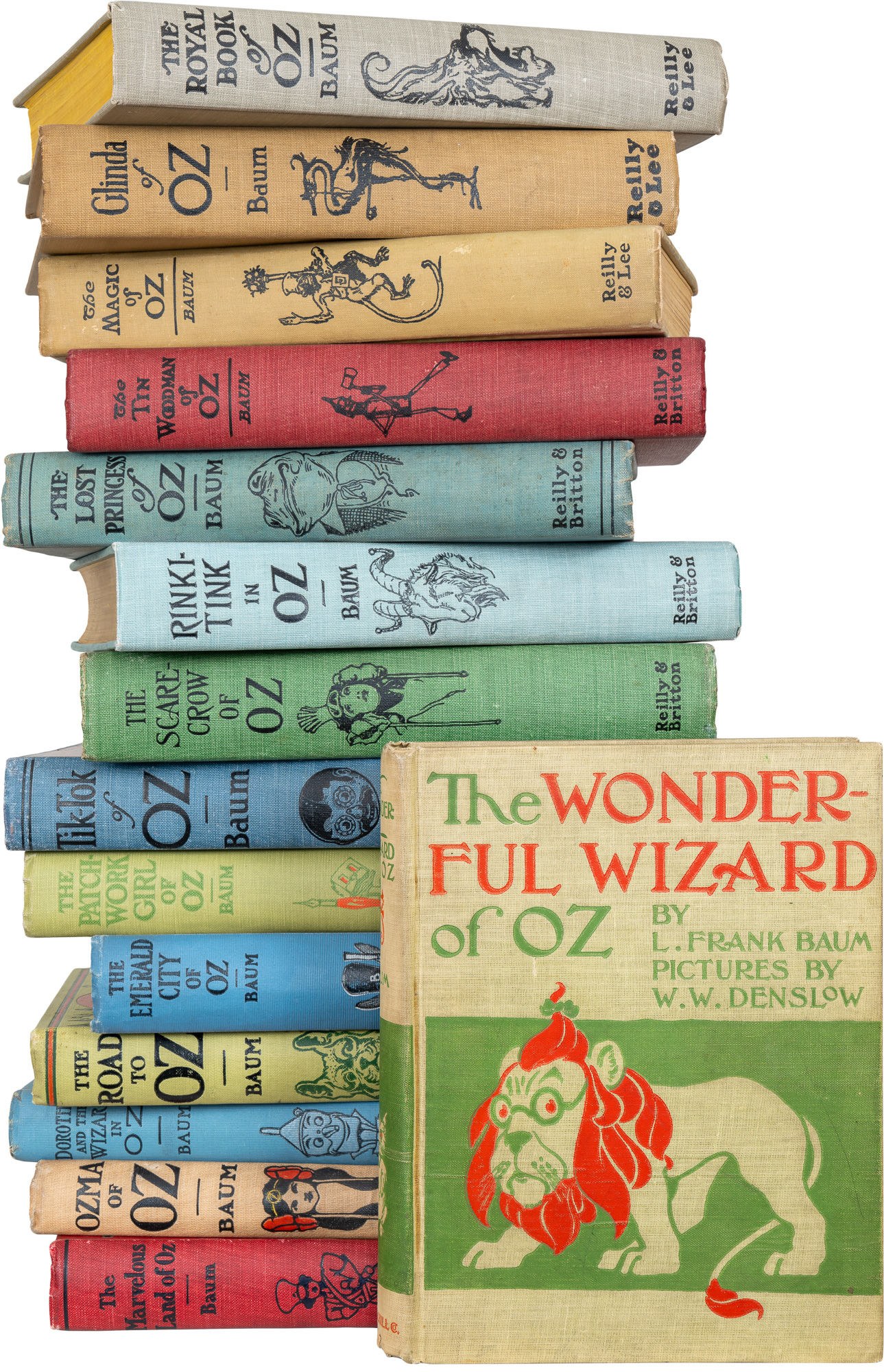
Chicago: Multiple, 1921. First Edition. Fine. Chicago: Multiple, 1900-1921. 15 vols. 13 of the 15 are the 1st issue throughout, Wizard is a later issue from December 1900, and Marvelous Land has 1 point wrong (rare, despite evasive descriptions), but these are clean and beautiful copies (again, rarely seen like this despite evasive descriptions). A truly superior set, unlike any other set previously assembled or that could be assembled today. This set has, expectedly, no direct comparable for sale. 2 of the 15 are as fine as any of the copies being offered for sale anywhere and the other 13 are finer than any of the copies being offered for sale. And that should make you say, “hmmm†and then concede that buying some other set or the flailing after fruitlessly trying to compile your own collection of the 15, makes less sense than dry cleaning a goat.
The Wonderful Wizard of Oz (1900): First edition, later issue (though, technically, a later printing) with the publisher's imprint at the base of the spine in red. Conforming to state 2 and binding ‘variant C’ of Bibliographia Oziana. The spine’s base is slightly frayed, but it’s all there, and it’s otherwise near fine— splendid condition.
The Marvelous Land of Oz (1904): First edition, second state of the title page with a copyright (only a few copies are known that escaped the publisher with no copyright, despite some being incorrectly logged in the auction records). A few small points of wear to the extremities, else near fine, one of the finest copies we've seen of this scarce book.
Ozma of Oz (1907): First printing, first issue with a color illustration on page 221, first binding with 'Co' after the publisher's name at base of spine. Some very light spotting, else near fine. Scarcely seen in anything approaching this condition.
Dorothy and the Wizard in Oz (1908): First printing, first issue with advertisements on the verso of the half-title listing only 3 books and the first binding with The Reilly & Britton Co. in large and small letters at the base of the spine. Front inner paper hinge strengthened and a bookplate on verso of ownership page, else near fine.
The Road to Oz (1909): First edition, first printing, first issue with color tinted paper on leaf of ads at the end and no ad for Rinkitink at front. Fine.
The Emerald City of Oz (1910): First edition, first printing, with Reilly & Britton at the base of the spine and five ads ending with John Dough.
The Patchwork Girl of Oz (1913): First edition, first printing and first state with "C" in "Chapter" overlapping the text on page 35, the first binding in green cloth, not tan, and with Reilly & Britton at the base of the spine. Near fine.
Tik-Tok of Oz (1914): First edition, first printing and first state with Reilly & Britton at the base of the spine, and ads ending with Patchwork Girl. Rubbing, primarily to the color surface coating of the cloth, neat gift and ownership inscriptions, else near fine.
The Scarecrow of Oz (1915): First edition, first printing with Reilly & Britton at the base of the spine, and ads ending with Scarecrow of Oz.
Rinkitink in Oz (1916): First edition, first printing and first state with Reilly & Britton at the base of the spine, and no ads. Fine.
The Lost Princess of Oz (1917): First edition, first printing and first state with Reilly & Britton at the base of the spine, and ads ending with Lost Princess. Paper hinges strengthened, rubbing and soiling, else very good.
The Tin Woodman of Oz (1918): First edition, first printing with Reilly & Britton at the base of the spine, and ads ending with the Tin Woodman.
The Magic of Oz (1919): First edition, first printing with Reilly & Lee at the base of the spine, and ads ending with Tin Woodman. Some spotting and rubbing to the cloth, else very good.
Glinda of Oz (1920): First edition, first printing of the last Oz book written entirely by Baum, with Reilly & Lee at the base of the spine, and ads ending with Glinda. Near fine.
The Royal Book of Oz (1921): First edition, first printing with Reilly & Lee at the base of the spine, and no ads. Outlined and begun by Baum, and with his name as author on the title page, but completed by Ruth Thompson who then continued to write them through the 1930s. Fine copy, the finest we have seen.
L. Frank Baum's Oz series represents one of the most significant contributions to American children's literature, pioneering a distinctly American fairy tale tradition that broke from European models. Unlike their Old World counterparts with their moral lessons and cautionary tales, Baum's stories embraced imagination, self-reliance, and the American spirit of adventure. The consistent quality across the fourteen volumes demonstrates Baum's remarkable ability to create a vast, internally consistent secondary world that preceded Tolkien's Middle Earth by decades, establishing a blueprint for fantasy world-building that influences creators to this day.
The literary witch traces back to Circe in Homer's Odyssey and figures like Morgana in Arthurian legend, but the modern witch began with Basile's Sleeping Beauty (originally titled Sun, Moon and Talia) in his Pentamerone (1634). However, it was Baum's The Wonderful Wizard of Oz that gave the witch—specifically the Wicked Witch of the West—genuine depth, largely because Baum developed his characters by understanding that writers transform thoughts into language while readers convert language back into thoughts. His innovation of the good witch sister further enriched this tradition. This dual nature of witchcraft reflects a broader principle: that the cleverly expressed opposite of any generally accepted idea holds tremendous value in our capitalist society.
Beyond their literary innovation, the Oz books offer a fascinating window into early twentieth-century America. The stories feature strong female characters and question traditional power structures at a time when American society was beginning to undergo significant social changes. Through colorful characters and fantastical situations, Baum wove commentary on everything from politics and economics to human nature itself. The economic allegories embedded throughout (particularly in the first book's references to the gold standard debate) and Baum's subtle commentary on American expansionism reveal a depth that makes these beloved children's books equally rewarding for adult readers, ensuring Oz's lasting place in American cultural consciousness.
Offered by Biblioctopus
California
Jo Mora

Jo Mora's iconic 1945 map of California.
Jo Mora was famous for his maps, and for good reason. He reinvigorated a century-old tradition of designing maps with the specific intention of prominent display, and then proceeded to fill these maps with his own personal cocktail of humor, knowledge, and skill. His typical style was that of a pictorial map, a genre most historians agree began with the Wonderground Map of London from 1914. By the time Mora was producing his maps, the genre was both established and very popular, often being in advertising.
Mora was born in Uruguay, and despite growing up in Massachusetts, he was fascinated by the lifestyles and landscapes of the American West from an early age. Eventually, he settled in Carmel-by-the-Sea in California, and this is today viewed as his hometown. This excellent color lithograph from 1945, which measures 18.75 x 24.5 inches (on a sheet 22.25 x 28.5 in), depicts his adopted state of California in all its glory. It is the second California map by Mora's hand and constitutes a whimsical and loving view of the state in its entirety.
As is typical of Mora's cartes, as he called them, one immediately notices the presence of pictorial, often caricatured elements throughout the map. Among the vignettes on the map itself, we find images of historical figures such as Sir Francis Drake and Juan Rodrigues Cabrillo – both famous 16th-century explorers that sailed on California. But the map also includes various local wildlife species, references to Native peoples, and essential natural landmarks like Yosemite and Mt. Whitney. Historical landmarks are featured in a series of individual vignettes along the left flank of the map (essentially in the Pacific Ocean). The locations consist primarily of California's historical missions but also include a depiction of the Golden Gate Bridge and Oakland Bay Bridge in San Francisco.
Mora further augments the map by inserting an ingenious historical timeline in the upper right corner, consisting of a progression of human figures, from conquistadors to modern construction workers. Below the timeline anchored in human characters, we find a parallel reflecting the passage of time through a humorous depiction of vehicles, spanning from caravels and ox-drawn carts to private motorists and trans-Atlantic steamships. And the span between these naturally includes famous California icons such as prairie schooners and the Transcontinental Railroad. This use of personages and transportation to document some of the important developments in the state's history is typical of Mora's style and approach and part of the reason that his output resounded so broadly in the American public.
The whole map is a visual bombardment of layered information. Looking at it is an experience in which one constantly spots new elements and learns new things. But to find the passion that drove the man behind the map, we must look to the wonderful title cartouche in the lower-left corner. Designed as a tribute both to the State of California (represented by its Great Seal and California's emblematic bear) and to the great mapmakers of yore (seen in the general composition and placement of the cartouche, as well as in details like the crowning compass rose), Mora uses this space to express his personal sentiments towards California. Rather than paraphrasing, let us give the artist himself the final word:
It is now past forty years since first I sifted into this glorious Eldorado of the West, forking the hurricane deck of a Sorrel pony. I had come a long trail and here was the Promised Land! It's been my home range ever since. I've known here plenty grass – I've known it mighty short. That's life. My wife and kids are native son and daughters and I feel I may sing in all truth and sincerity "I love you, California." …Well, I'm strong for those souls who smile at their devotions: so, you see, I've tried to make this in a manner to help you keep the corners of your mouth on the up and up during the perusal of my CALIFORNIA.
A devoted adopted son, Jo Mora
Cartographer
Joseph Jacinto "Jo" Mora (October 22, 1876 – October 10, 1947) was a polymath. He was a renowned illustrator, painter, muralist, sculptor, respected art historian, cowboy, and a pioneering ethnographic photographer.
Mora was born in Uruguay but emigrated with his parents to the United States when he was still a child. Settling on the East Coast, Mora went to art school in New York and later worked as a cartoonist for various newspapers in Boston. In 1903, Mora decided to leave the East Coast for California. He would not stay long, though, for the following year he moved again to Arizona, where Mora sought out Hopi and Navajo communities, with whom he settled for an extended period and learned about their languages and cultures.
As part of his work on Hopi and Navajo customs, Mora was one of the first outsiders to be allowed to document ceremonial events and specific individuals using a camera. His systematic effort to record the life and customs of these people is today one of the finest ethnographic collections on the Native tribes of Arizona.
In 1907, Mora was married and moved with his wife to California. Slowly building his career as an illustrator and graphic artist, he settled in Pebble Beach in 1922, where he established a large studio within his home. With his base now set, Mora illustrated a number of popular books, including Dawn and the Dons, The Romance of Monterey (1926), Benito and Loreta Delfin, Children of Alta California (1932), and Fifty Funny Animal Tales (1932). He also wrote three books himself: A Log of the Spanish Main (1933), Trail Dust and Saddle Leather (1946), and Californios (1949), which was published two years after his death.
Outside his work as an illustrator, Jo Mora is best known for his innovative approach to cartography. After moving to Pebble Beach, Mora began producing a range of attractive maps that drew audiences in with their combination of cartoons and reliable information. Among his more essential maps, we find Monterey Peninsula (1927), Seventeen Mile Drive (1927), California (1927 & 1945), San Diego (1928), Grand Canyon (1931), Yosemite (1931), Yellowstone (1936), Carmel-By-The-Sea (1942), and his Map of Los Angeles (1942).
Condition Description
Very good.
Offered by Neatline Antique Maps
ABC CARDS
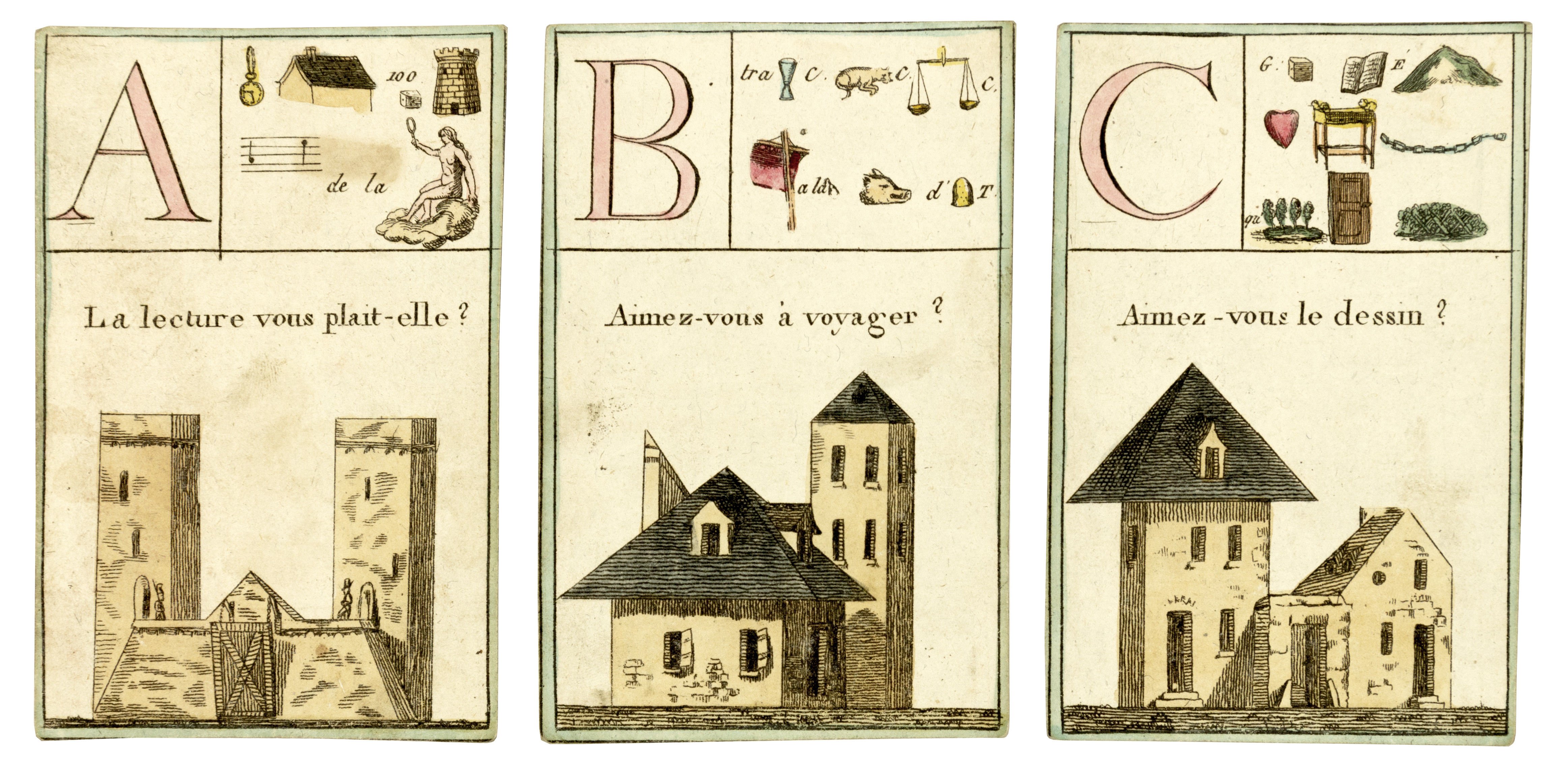
1815. [ALPHABET]. ABC CARDS. [ABC, rebus, architecture, divination]. 25 engraved and hand coloured cards. 105 x 68 mm. [Paris: Chez les Marchands de nouveautes, ca. 1815.]
A splendid set of architectural alphabet cards. Each card has a building in the lower two thirds. The top third is divided in two with a letter of the alphabet on one side and a rebus on the other, all finely coloured by hand. Extremely rare.
Offered by Ursus Books
The Holy Bible, Containing the Old and New Testaments
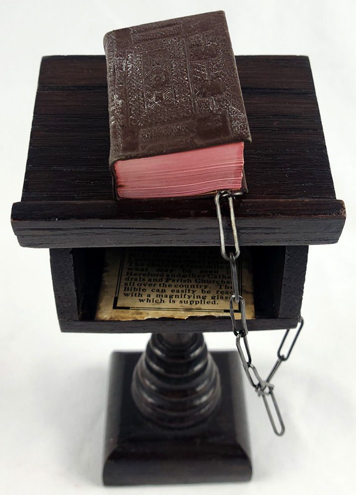
876pp. Printed on India paper and illustrated with black & white plates. Bound in full brown leather stamped in blind on the covers and lettered in gilt on the spine, with a pocket inside the rear cover containing a leather-bound magnifying glass. Attached to the rear cover is a metal chain that holds the book to a miniature wood lectern, as was the practice for full-sized Bibles in sixteenth-century English churches. There is a shelf for storage of the Bible under the lectern. On the bottom of the shelf is a paper label explaining how the Bible came to be chained—most examples of the lectern have the label at the underside of the base. Quite possibly among the most pristine examples extant: The Bible retains what appears to be an original white paper band, which has left faint residue to spine. Printing residue to top edge and to center of fore edge. Otherwise fine and minimally handled, if at all. Lectern and chain very fine. (Bible 1 7/8 by 1 3/8; 47x33mm; lectern 5 1/2 (height) by 3 1/8; 141x81mm).
Offered by Philip Salmon & Company Rare Books
(Bound by Monique Lallier) TO EVERYTHING THERE IS A SEASON
Wilson, Milton (editor)
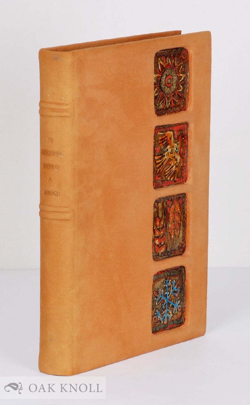
Index. Published to commemorate the centennial of Canadian independence in 1967. Designed and photographed by Roloff Beny. Foreword by Beny, preface by Pierre Dupuy, acknowledgments, closing comments by Marshall McLuhan. A collection of poems and journals selected by the editor. Fifty-six pages in full color, 144 pages in photogravure, ten maps and line drawings. Signed binding by Monique Lallier, suede leather with four inlaid dried clay designs near fore-edge of front cover. Two double raised bands and gilt-stamped title on spine. Designed paper endpapers. Prospectus laid in.
N.P.: Longman's Canada, n.d., but circa 1967; small folio, suede, suede and designed paper endpapers. variously paginated.
Offered by Oak Knoll Books/Oak Knoll Press
Things To Come: A Film [Inscribed to Anita Loos with Telegram and Photograph]
Wells, H.G

New York: The Macmillan Company, 1935. First American Edition. 8vo, 155pp. Inscribed by Wells to Loos with love and adoration on the half title and dated in 1935. Loos' modernist pictorial bookplate on front pastedown. Publisher's gray and blue cloth worn along edges and soiled in jacket with chipping, rubbing, and several tape repairs. A good copy. Single annotation in pencil on pg 154. Laid in is a print of the famous photograph of Wells and Loos together and a Western Union Telegram dated in 1935 from Wells to Loos, with toning and folds.
First American edition of the film adaptation penned by Wells and loosely based on his science fiction classic from 1933, The Shape of Things to Come. The script was turned into a film a year later directed by William Cameron Menzies.
This copy with a lovely provenance, inscribed by Wells to his friend and author of "Gentlemen Prefer Blondes," Anita Loos. Like many writers of the time, Wells was enamored with Loos' 1925 work, praising it both publicly as well as directly to Loos, calling it "the best book ever written" in a telegram to her. When Loos visited London in 1926 following the book's release, Wells took her out to dinner. She would return the favor some 9 years later when Wells visited Hollywood to delve into the world of filmmaking, he having recently become involved in the Menzies production The Things to Come, which would debut the following year. The famous photo of Loos escorting Wells to dinner was taken during that short visit in December of 1935, whence the telegram is also dated (and which also discusses dining!):
"Palm Springs Dec 22. Miss Anita Loos. MGM Studios CY. Desolated but we are lunching at Ensenada Love. H.G."
An inscribed, personal copy of an important work from Wells, and a charming set linking the two luminaries.
Offered by Peruse the Stacks
Artickel so da hetten sollen aufs Concilion zu Mantua oder wo es würde seyn, überantwortet werden, von unsers teils wegen. Und was wir annemen oder geben Kündren oder nicht. Fr. M. Luther.
LUTHER, Martin
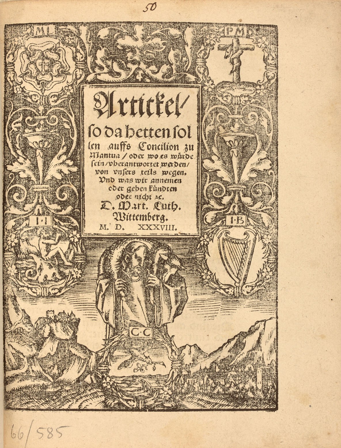
The Smalkalde Articles, written by Luther in 1536 in preparation for the Council of Mantua.
"Schmalkaldic Articles are one of the confessions of faith of Lutheranism".
4to of (32) ll. Half-vellum, flat spine, brown morocco lettering piece. 20th century binding.
191 x 151 mm.
Rare first edition of the "Articles of Smalkalde" written by Luther in 1536 and which offer a synthesis of his doctrine.
Graesse, Trésor de livres rares, 306.
Luther's attacks on the papacy were repeated and virulent. In 1535, Pope Paul III wearily proposed convening a council. The Protestants of the Smalkalde League, meeting in assembly, nevertheless made demands to take part. The council was convened in Mantua for May 1537. Immediately Luther compounded what would later be known as the Smalkalde articles, in which he exhibited the essential points of his doctrine. The Council was postponed and did not take place until 1545 in the city of Trent.
" In 1534 Alessandro Farnese was elected as Pope Paul III with a clear message of internal church reform. To further this mission and to respond to the rise of Protestantism, he called for an ecumenical church council to meet at the Italian city of Mantua in 1537. Given the importance of this council for Christian unity and the future of reformed forms of worship, the elector of Saxony asked Luther to prepare an official statement of doctrine that would both represent his views and indicate where negociation might be possible. Luther agreed, and, with some imput from his Wittenberg colleagues, carefully laid out what he saw as the central pillars of Christian teaching. Yet these doctrinal statements, or articles, were never presented at the council – which was delayed a number of times, finally meeting in Trent beginning in 1545. Instead, they were discussed at a general meeting of the Protestant Schmalkaldic League, although even here the collected princes and theologians declined to affirm them, due mostly to concerns that they were too exclusionary and divisive, especially the statements on the Eucharist and papacy. Luther then published the articles in 1538, adding a preface but leaving their structure and content otherwise intact... As these articles offered a clear and comprehensive summary of Luther's doctrine, they would be extremely important as a Lutheran confession of faith, and in 1580 would be incorporated into the authoritative collection of fundamental Lutheran documents known as the 'Book of Concord'…" (The Essential Luther, 23).
"Schmalkaldic Articles are one of the confessions of faith of Lutheranism, written by Martin Luther in 1536. The articles were prepared as the result of a bull issued by Pope Paul III calling for a general council of the Roman Catholic Church to deal with the Reformation movement. (The council was actually postponed several times until it met in Trent in 1545.) John Frederick I, Lutheran elector of Saxony, wished to determine what issues could be negotiated with the Roman Catholics and what could not be compromised. He asked Luther to review earlier statements of faith by the reformers to determine what was absolutely essential to the faith. After Luther prepared the articles, he invited several reformers to Wittenberg to discuss them, and after some minor changes eight theologians signed them. They were then sent to the elector in January 1537.
In February 1537 the Protestant secular heads of state who were members of the Schmalkaldic League met with several theologians at Schmalkalden to decide how to deal with a council of the Roman Catholic Church. Luther became ill and could not attend, but John Frederick I presented Luther's articles to the gathering. Because of Luther's somewhat controversial doctrine of the Lord's Supper, Philipp Melanchthon urged that the Augsburg Confession and its Apology, previously presented to Emperor Charles V, adequately presented the reformer's faith and that additional statements should not be added. This decision was adopted, and the Schmalkaldic Articles were not officially accepted. They were, however, circulated and read, and 44 theologians signed them as an expression of their personal faith. Subsequently they were included in the Book of Concord (1580).
The Schmalkaldic Articles are divided into three sections. The first discusses the unity of God, the Trinity, the Incarnation, and Christ, and on these subjects Luther believed there was no real controversy between Roman Catholics and Protestants. The second section dealt with Christ and justification by faith. According to Luther, "On this article rests all that we teach and practice against the pope, the devil, and the world." This section also discusses the mass, monastic orders, and the papacy. The third section discusses 15 articles that could be considered by Roman Catholics and Protestants. It includes such subjects as sin, the Law, repentance, the sacraments, confession, the ministry, and a definition of the church".
FRANCAIS
Les articles de Smalkalde rédigés par Luther en 1536 en vue du concile de Mantoue.
In-4 de (32) ff. Demi-vélin, dos lisse, pièce de titre de maroquin brun en long. Reliure du XXe siècle.
191 x 151 mm.
Rare édition originale des " articles de Smalkalde " rédigés par Luther en 1536 et qui offrent une synthèse de sa doctrine.
Graesse, Trésor de livres rares, 306.
Les attaques de Luther contre la papauté sont réitérés et virulents. En 1535, de guerre lasse, le pape Paul III propose de réunir un concile. Les protestants de la ligue de Smalkalde réunis en assemblée posent quand même des exigences pour y participer. Ce concile est convoqué à Mantoue pour le mois de mai 1537. Aussitôt Luther compose ce qu'on dénommera plus tard les articles de Smalkalde où il expose les points essentiels de sa doctrine. Le concile sera reporté et n'aura lieu qu'en 1545 dans la ville de Trente.
Offered by LIBRAIRIE CAMILLE SOURGET
Original concept illustration for the cover of Broad Stripes and Bright Stars
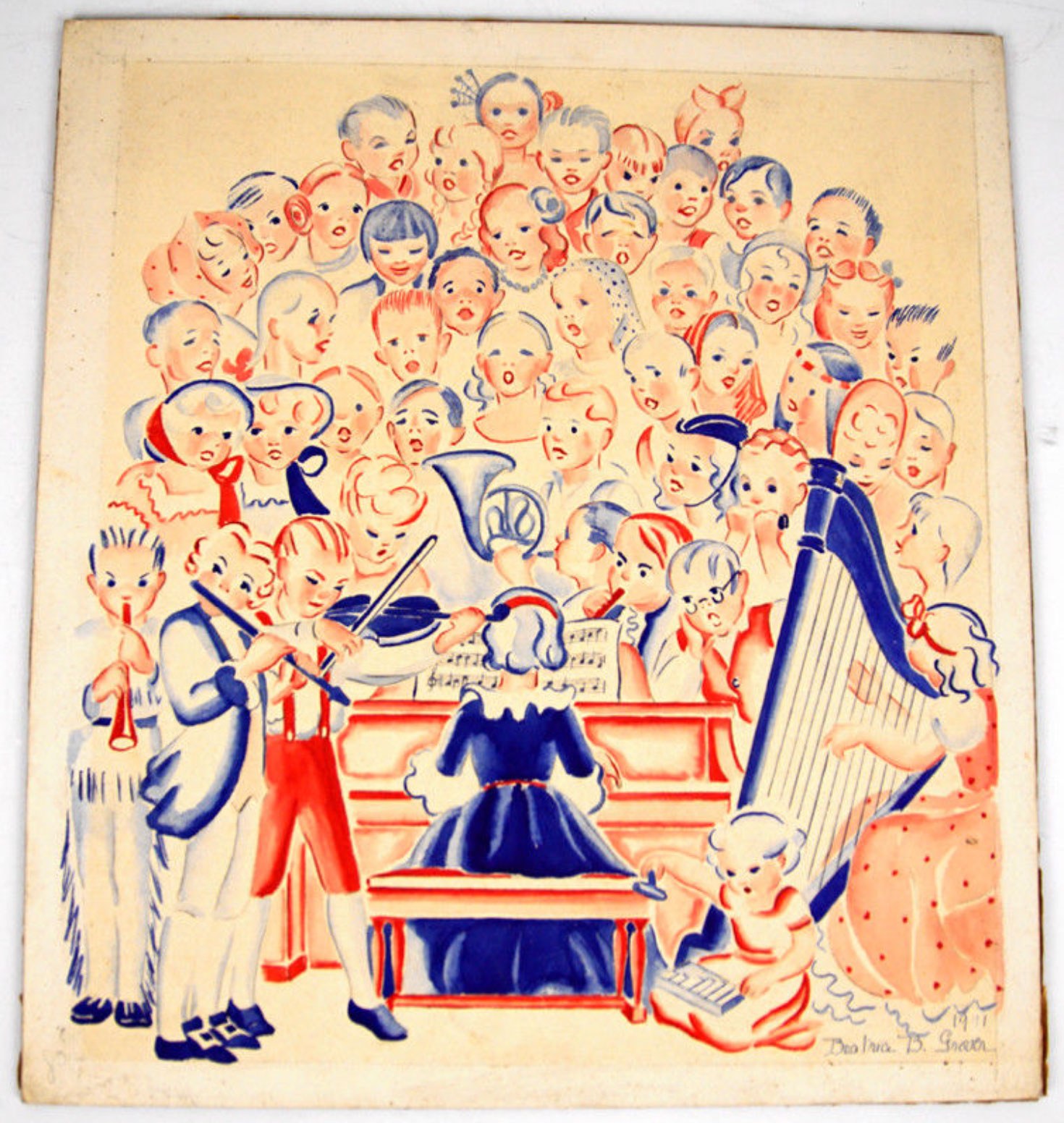
Signed and dated by Grover, with additional caption and initials in pencil at reverse. Original art for Gover's patriotic children's book, published by the Greystone Press of New York in 1941. At once propagandistic and playful, the illustration - like the book entire - portrays children of all nationalities singing and playing musical instruments. Once published, the image became intensely and solely American, no doubt to suit the wartime atmosphere. The diverse, rainbow chorus was replaced by an American flag. Some printer's proof marks to margins, tape to rear, else fine. 13 x 11 3/4 in.
Offered by Philip Salmon & Company Rare Books
New Dissected Map of the United States
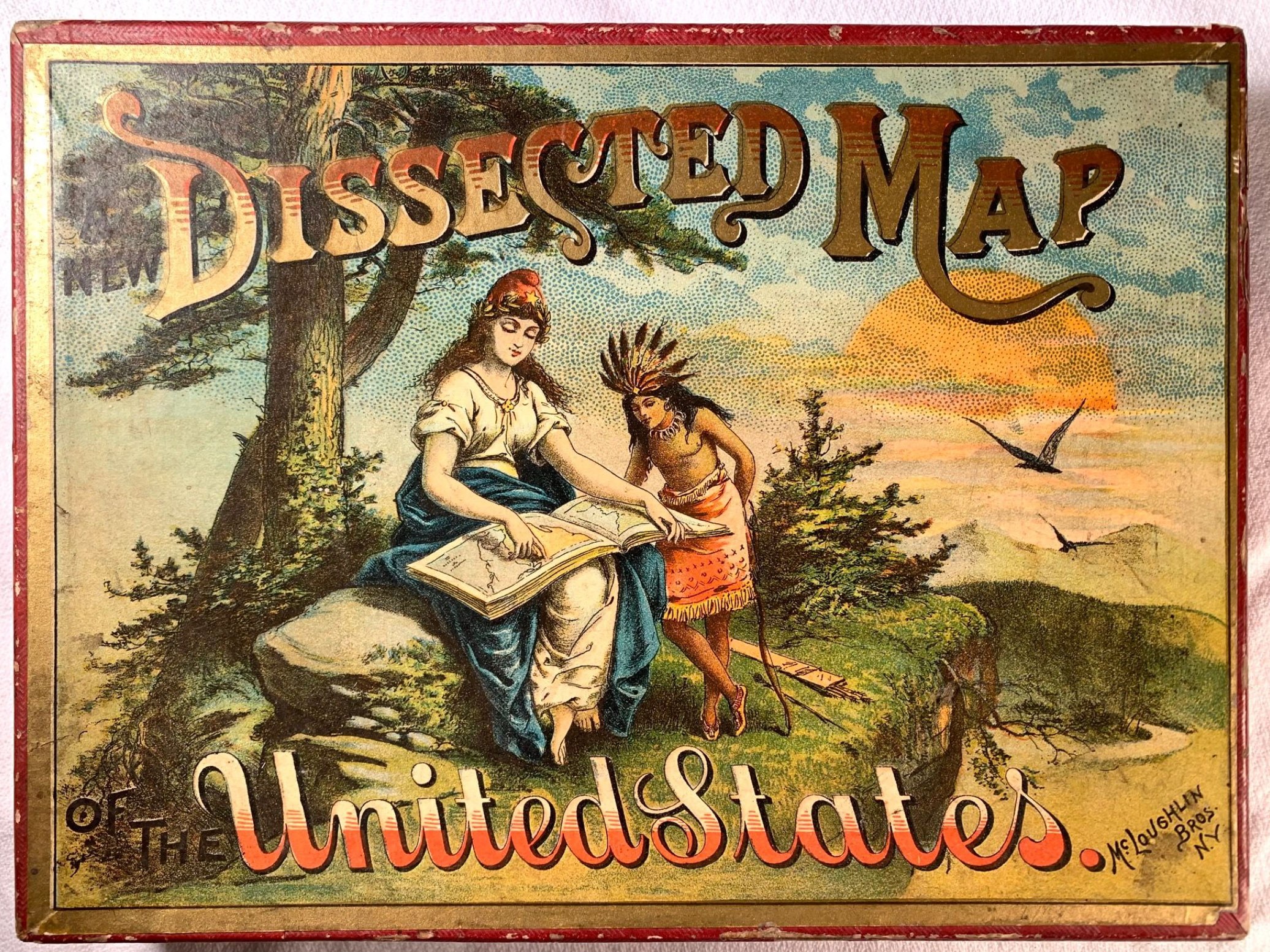
New York: McLoughlin Bros, 1887. Circa 1887 28-piece color jigsaw puzzle comprised of laminated paper. Only the edge pieces are interlocking, with the interior pieces rectangular. Complete with folding map copyrighted 1887 by McLoughlin Bros., in good condition with light wear at folds. The original box, in good condition, is worn at edges, light soiling. Chromolithographic cover to box depicts Lady Liberty with atlas on her lap showing a young 'native' student the atlas. Map measures 13 x 8.5 inches when completed.
Offered by Stellar Books & Ephemera, ABAA
ILLUMINATED SPANISH MSS WITH A FINE ORIGINAL FULL-PAGE IMAGE, IN COLOR, OF A RECUMBENT CHRIST - ORIGINAL SILK BINDING!

"Ejecutoria de HidalguÃa ganada por los Caballeros hijosdalgo de los Señores Don Nicolás Antonio de Arjona y Don Zoilo Alfonso de Arjona".
4to. 33 x 23 cm. Contemporary silk binding. Three manuscript pages + vellum folio containing a beautifully rendered depiction of the spiritual state of Solitude with a figure of a recumbent Christ, with two cherubim at his feet, and angels with a Virgin Mary + illuminated vellum folio with coat of arms of nobility of the Arjona Family with colored helmet + two vellum pages with a genealogical tree + cover + five blank folios+ 211 folios.
RICHLY ILLUMINATED SPANISH "CARTA DE HIDALGUIA. According to seventeenth century writer, Bernabé Moreno de Vargas, a patent of nobility (hidalguÃa) consists of a transcription of a favorable outcome of a lawsuit filed before the Chancellories of Ciudad Real, Granada, and Valladolid. on behalf of individuals, families, and often of entire lineages, recognizing the plaintiff's or plaintiffs' noble status.
After January 20, 1703, the competencies for determining noble status would fall exclusively on the Chancellories of Valladolid and Granada in order to protect the impoverished Royal treasury from tax evasion.
This patent of nobility or hidalguÃa concerns the families of Don Nicolás Antonio de Arjona and Don Zoilo Alfonso de Arjona in 1726.
Artfully decorated, the depiction of the family's noble coat of arms is especially worthy of mention. The document examines the two genealogical trees and stands as a good example of the heraldic literature of the time
Offered by LIBRERIA DE ANTANO
The Grapes of Wrath
Steinbeck, John

1939. New York: Viking, 1939.
8vo, 619 pp. Original beige cloth with pictorial decoration in brown, unclipped dust-jacket. A fine copy in a near fine dust-jacket, unusually bright with only a few touches of abrasion and a hint of shelfwear to the ends of the folds.
A First edition in a first issue dust-jacket with the price $2.75 and 'First Edition' statement on the inside flap. A beautiful copy of Steinbeck's greatest book, which won him the Pulitzer Prize and figured largely in his later receiving the Nobel Prize. The screen version was one of those rare occasions when a great book became a great film, winning two Oscars. Payne and Goldstone A12a.
Offered by John Windle Antiquarian Bookseller
Unusual Photo Vase with Signatures of Her Friends Surrounding a Young Woman, 1893
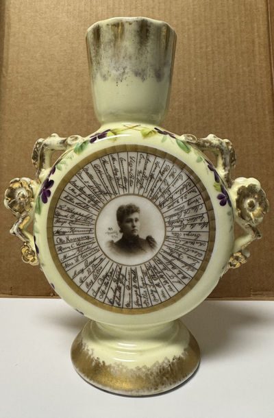
While the vase itself was made in France, the woman and her friends were American. I'm not sure where they lived, although I had a few leads in Ohio after a few basic searches. Whatever the case, this piece is a fantastic example of the genre. I've seen a few other photo signature/autograph vases and a plate over the years but they are not at all common. The application of photos onto cups, plates, vases and other china was a bit of a fad, albeit a more expensive and odd one, at the end of the 19th century. This example is very fine.
Offered by Erin Waters Fine Photographs
Pierre; Or, The Ambiguities
Melville, Herman
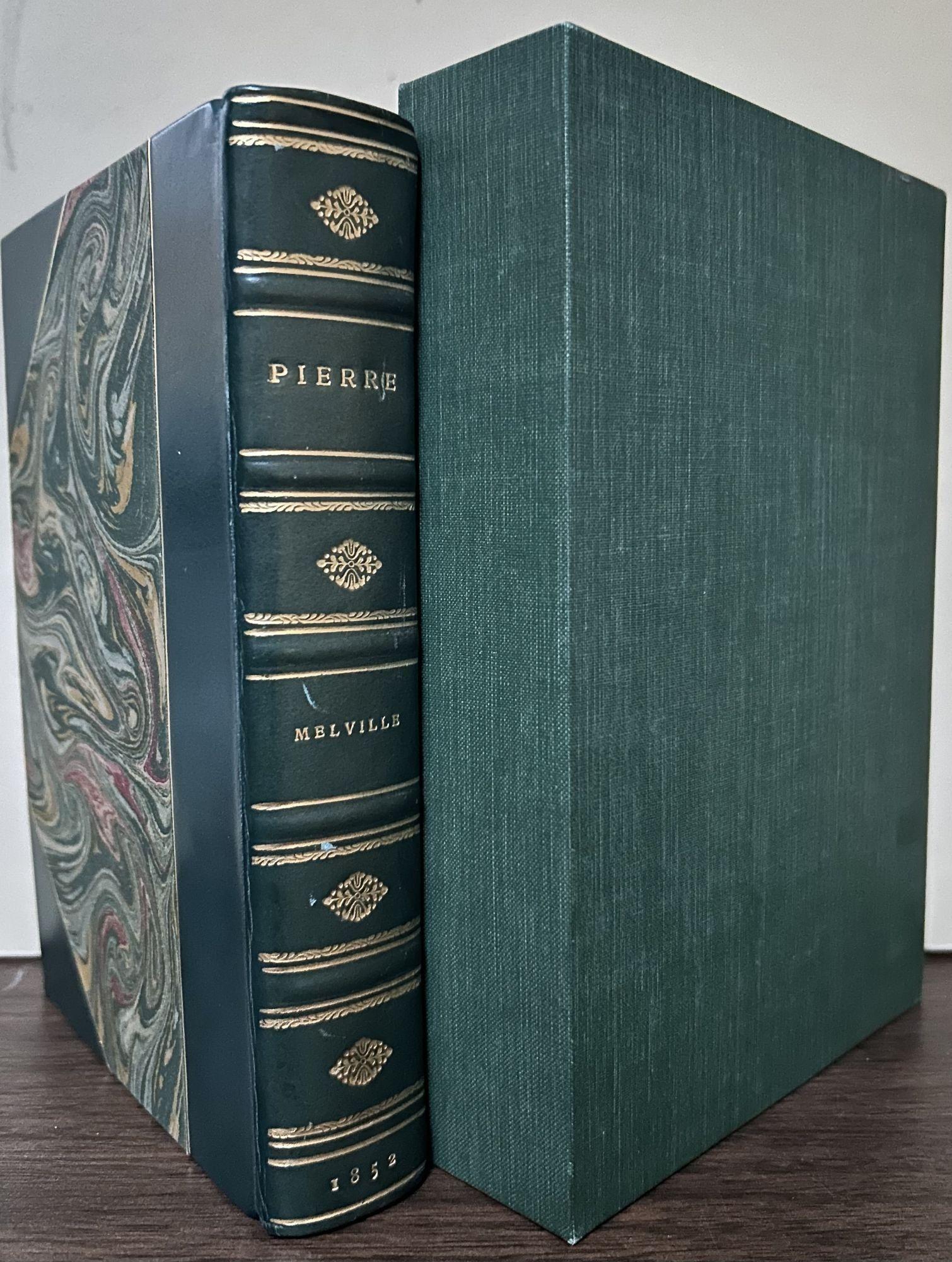
New York: Harper & Brothers, Publishers, 1852. First edition. Hardcover. Modern three quarter dark green calf, marbled boards and matching marbled endpapers. Teg. Fine in matching fine green cloth slipcase. 495 pages. 18.5 x 13 cm. First edition of Melville's follow up to Moby Dick which is somewhat uncommon as a large portion of the first edition of Pierre was destroyed in the 1853 fire at Harper & Brothers. Melville's seventh book, the story of Pierre Glendinning, his fiancée Lucy Tartan, and his illegitimate half-sister Isabel. Its poor reception, followed first by the equally unsuccessful Israel Potter and then The Confidence-Man, would represent the nadir of Melville's writing career. Tiny .06 cm spot to title but interior contents are very bright, fresh and clean.
Offered by Royoung bookseller, Inc.
Montmartre vecu par Utrillo. Illustrated with 22 color lithographs
UTRILLO, Maurice || CARCO, Francis
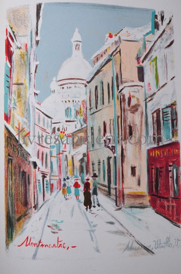
Large 4to (383x280mm), 157-(5) pages. 22 color lithographs including 12 full-page.
Binding : Contemporary half morocco. Original printed covers bound in.
First edition, limited edition of 240 copies.
Our copy (b), illustrated with 22 color lithographs based on gouaches by Maurice Utrillo.
Offered by ERIC ZINK LIVRES ANCIENS
The Hudson's Bay territories and Vancouver's island, with an exposition of the chartered rights, conduct, and policy of the Honorable Hudson's Bay Corporation.
MARTIN, Robert Montgomery
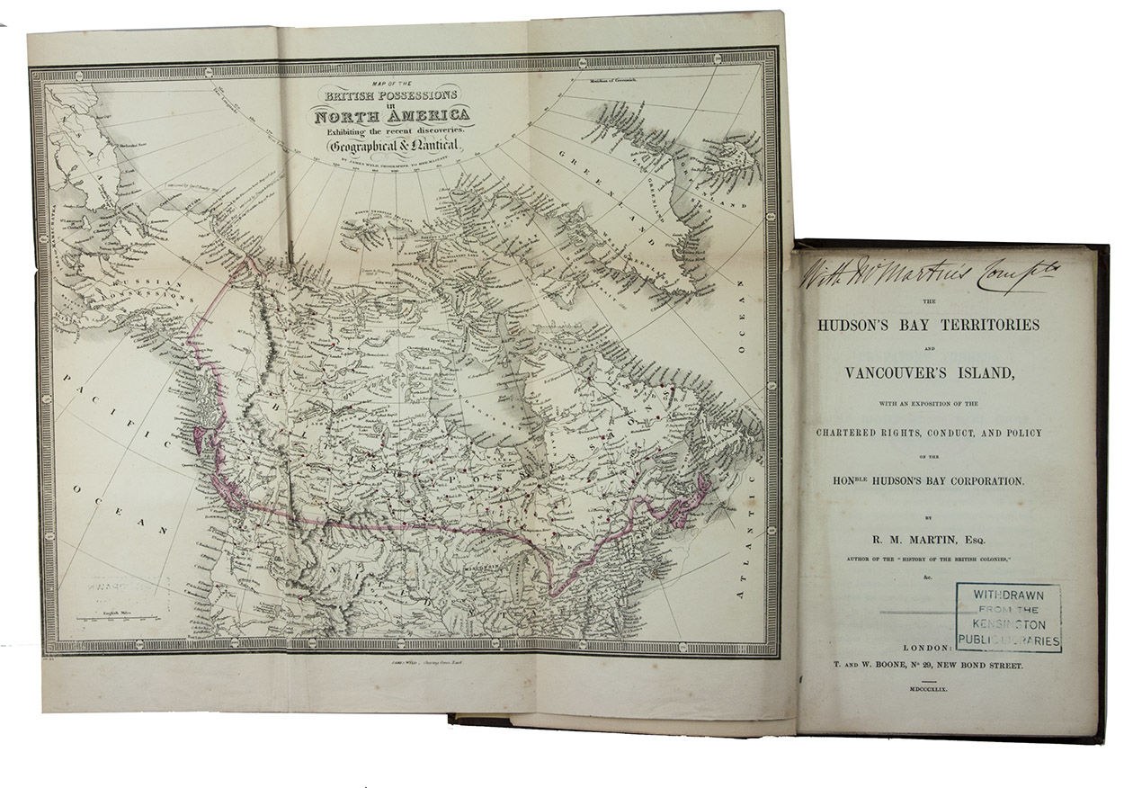
Second edition of an interesting investigation of the policy, conduct and operations of the Hudson's Bay Company on the Pacific coast and in the Canadian north-west, by the historian and statistician Robert Montgomery Martin (1803(?)-1868). The Company was founded in 1670 and originally traded in fur, but also functioned as a de facto goverment in North America. In the 19th century the company grew and traded all sorts of wares. The first chapter deals with the geography and climate of the area, the second with the "constitution and working of the Hudson's Bay Company", the third with "the Indian population, their numbers, character and treatment by the Hudson's Bay Company", and the fourth with the "christian conduct and beneficent policy of the Hudson's Bay Company", closing with a summary.
With a presentation inscription on title-page by the author. With library/deaccession stamps. Bookblock detached from binding, but otherwise in very good condition and wholly untrimmed.
l DNB XXXVI, pp. 293-294; Sabin 44915.
Offered by Asher Rare Books
Educationis puerilis linguae Graecae.Including: AESOP. Fabellae quaedam Aesopi Graecae, ad puerilem educationem selectae.
With: (2) [GOLIUS, Theophilus]. [Grammaticae, sive educationis puerilis linguae Graecae. ... Pars altera].3 parts in 1 volume.
GOLIUS, Theophilus
Second copy located of the 1618 edition of a selection of 36 fables by Aesop, printed in two columns: left Greek and Latin right, included as integral part of a well-known and very influential Greek grammar by the Strasbourg professor Theophilus (Gotlob) Golius (1528-1600) for use in the Strasbourg Gymnasium.
With an owners inscription from one of the most beautiful libraries in the world: the library of the Monasterium Premostratense (the Strakov Library) in Prague: "Bibliotheca Monserratensi Pragae". Manuscript annotation on title-page: "Fabellae quaedam Aesopi Graecae, ad puerilem educationem selectae". First few pages slightly browned. Otherwise in good condition.
l KVK & WorldCat (1 copy of parts 1 & 2 only?); cf. Kuiper, De Hollandse schoolordre van 1625 (1958), pp. 122-129 and 216-217 (other eds.).
Offered by Antiquariaat FORUM BV
The ABAA Virtual Book Fair: Holiday Edition will take place from 12 pm ET on Thursday, December 4 until 7pm ET on Saturday, December 6, 2025.
Shop the fair at www.abaa.org/vbf
